


Problem
Patients struggle with navigating the fragmented healthcare system, leading to confusion, delays, and higher costs.
Objective
Create an intuitive healthcare navigation platform that empowers users to easily research care options, book appointments, and manage personal health information within a unified experience.
Solution
Introducing an enhanced adoption experience! The new and improved Helen Woodward platform simplifies pet adoption by allowing users to filter for specific traits, take a pet-matching quiz, view detailed pet profiles with videos, and seamlessly complete the adoption process—all in one place.
Research Goal
To thoroughly understand the needs, behaviors, and pain points of patients when searching for and booking healthcare services.
Research Methods
Competitive analysis and user interviews


-1.png)
Based on the data above, a new competitor could successfully enter the healthcare navigation space by offering provider research and booking capabilities, in-person and tele-health services, personalized care experiences, access to care in rural areas, and transparent pricing.
I used affinity mapping to organize and analyze data from my user interviews, grouping insights into key themes and patterns to better understand patient pain points and needs in the healthcare navigation process.

Affinity Map Insights
Comprehensive information
Participants expect detailed provider profiles and specific metrics for informed decision-making.
Simplified booking experience
Participants desire streamlined booking for smoother scheduling and user convenience.
Personalization
Participants desire customized provider suggestions based on user history and preferences.
Rating system
Participants expect integrated provider ratings and reviews for straightforward comparison.
Educational resources
Participants expect content to clarify insurance and healthcare options to support user decision-making.
Accesible support
Participants desire a "Health Guide" feature for user assistance during the healthcare navigation process.
I created two user personas to represent key segments of my target audience, helping to ensure that the design solutions for Care Compass were tailored to meet the specific needs, expectations, and goals of real users.


I created POV (Point of View) and HMW (How Might We) statements to clearly define the user's needs and challenges.
Fragmented systems
Patients are frustrated by having to use multiple platforms for healthcare tasks.
Need for integration
Users want a unified platform for research, booking, and health management.
Convenience is key
Easy access and quick scheduling are top priorities for patients.
Insurance compatibility
Finding providers that match insurance plans is a major pain point.
Growing telemedicine interest
Users increasingly prefer virtual care for non-emergencies.
Importance of education
Users increasingly prefer virtual care for non-emergencies.
Personalization matters
Tailored recommendations based on health history improve user satisfaction.
Project Goals
Based on my research, I formulated the following goals to guide the direction of the design.
Feature Matrix
I had to narrow down the list of features for this project due to time constraints, focusing on those that would deliver the most immediate value to users. To achieve this, I created a feature matrix, ranking features as high, medium, or low priority.
Appointment booking
Filtering by insurance
Extensive provider network
User-friendly interface
Rating and review system
Coverage in rural areas
Hospital and procedure highlights
Educational healthcare content
Healthcare professional portal
Provider data syncing
Telemedicine options
Symptom checker
Insurance integration
Specialized care options
Based on the insights from the card sort exercise, I narrowed down the key features to four main options, focusing on those that aligned most closely with user preferences and would deliver the highest impact in improving the healthcare navigation experience.
Provider search
Locate providers based on location, specialty, and patient preferences
Rating system
Access provider ratings and reviews to make informed decisions
Booking capabilities
Seamlessly schedule appointments with providers
Health info hub
Explore a centralized resource with detailed health information
I conducted an open card sorting exercise, allowing users to organize and prioritize elements based on their preferences, which helped shape an intuitive navigation structure.

Commonalities: health management services, booking capabilities, provider search functionality, cost transparency, education and support tools, assistive healthcare services
I created a sitemap based on results of the open card sort to establish the information architecture, ensuring a logical and intuitive structure for the platform that allows users to easily navigate and access key features.

User Flows
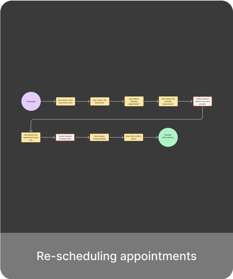
I developed user flows to map out the step-by-step processes that users would follow to accomplish tasks on the platform, ensuring a smooth and efficient experience from start to finish.


Task Flows
I created task flows to break down specific user actions into detailed steps, focusing on optimizing each interaction to ensure tasks could be completed easily and efficiently within the platform.


Brand Values
I chose to focus on a brand that embodies the values of unity, vitality, transparency, and integrity.
Color Pallet
To create a sense of well-being, trustworthiness, and care, I selected navy blue and teal green as primary colors, complemented by beige, black, and white as neutral tones, and accented by red and orange.


Typography
I chose the Montserrat typeface for its modern, clean, and approachable feel, which aligns with the values of trust, transparency, and vitality, helping to convey a sense of professionalism and warmth throughout the platform.
Brand Logo
After much iteration, I chose a compass as the logo to symbolize guidance and direction, reflecting Care Compass’s mission to help users navigate the complex healthcare system with clarity and confidence.
Final design
Initial ideas
I created low-fidelity wireframes to outline the basic layout and structure, allowing me to quickly visualize and refine the overall design before moving into more detailed iterations.

Homepage

Search Results

Booking Page

Account Dashboard

Care Academy
I developed high-fidelity wireframes to provide more detailed visual elements and interactions, ensuring the design was ready for prototyping and user testing.
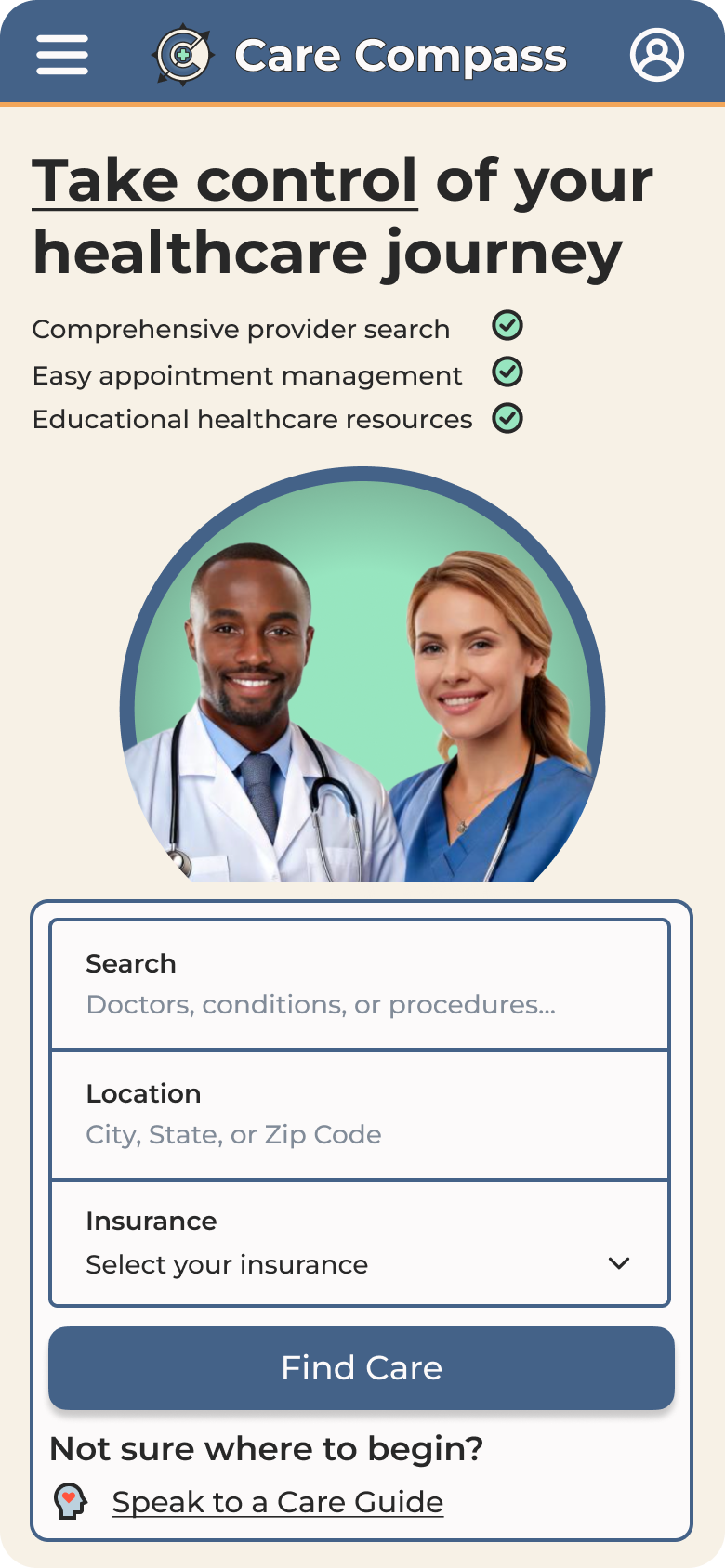
Homepage

Search Results
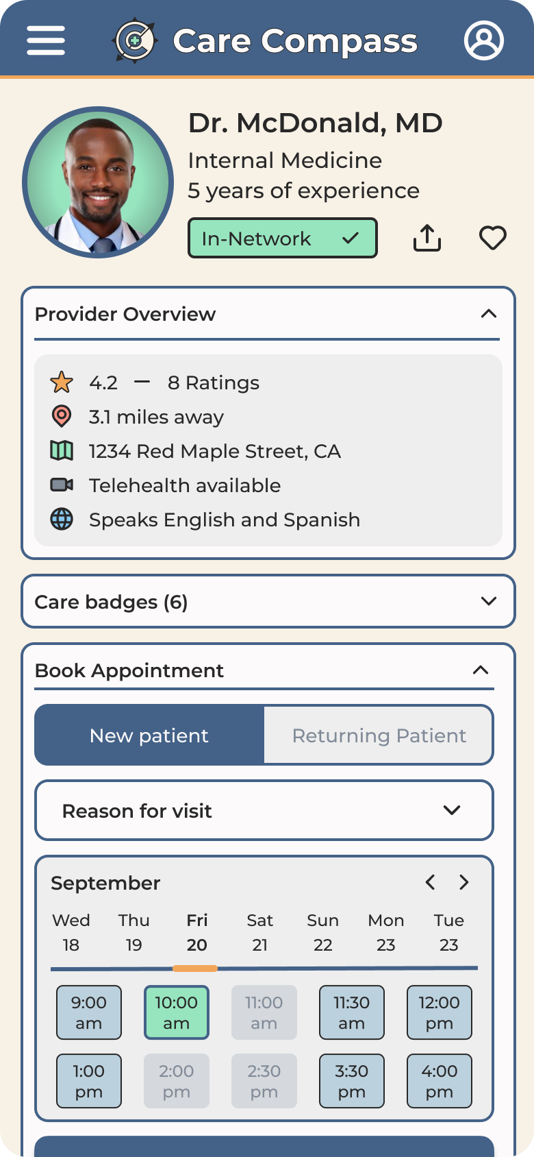
Booking Page

Account Dashboard

Care Academy
Connecting the dots
I created an interactive prototype to conduct user testing, enabling me to identify areas for improvement and further optimize the user experience.
Usability Testing
I conducted usability testing with the prototype to evaluate the ease of use, functionality, and overall user experience of key features. My goal was to identify usability issues, gather feedback, and suggest improvements based on users' interactions with the platform.
Methodology
5 participants were asked to complete the following:
Success Metrics
Success was based on 4 metrics:
Testing Results
The results from usability testing gave me valuable insights into user behavior and pain points based on number of errors they encounter and their satisfaction rating in various areas.

Insights
The results and feedback from usability testing provided valuable insights into navigation and feature clarity and how they can be improved.
Priority Revisions
I iterated on the design based on feedback from usability testing, addressing issues like improving navigation, clarifying button labels, and enhancing the appointment management process for a smoother user experience.


After implementing priority revisions based on usability testing feedback, I finalized the design, ensuring a seamless user experience, improved functionality, and a visually cohesive interface.


