


Problem
People struggle to discover and engage in straightforward and safe trade practices for items and services as current solutions are cumbersome and known to be untrustworthy.
Objective
The purpose of this project was to design a modern solution that allows users to easily trade items or services.
Solution
Introducing Trade Up! A platform that simplifies the trading process by allowing users to create listings, browse for items, and propose trades in a secure environment.
Research Goal
To thoroughly understand the behaviors, needs, and challenges that individuals face when discovering, and trading items with others.
Research Methods
Secondary Research
Collected data on current marketplaces as well user behaviors and preferences to gain insights into the bartering landscape. This research showed the need for a modern and safe solution for bartering.
User Interviews
Conducted in-depth interviews with patients to gain firsthand insights into their experiences, challenges, and expectations when engaging in bartering practices.
Competitive Analysis
Examined popular online marketplaces that specialize in trading to identify their strengths, weaknesses, and opportunities that could be exploited within the industry. This provided inspiration for the design to ensure it was unique.


Based on the data above, a new competitor could successfully enter the bartering space by offering a secure, gamified trading platform with trust-building features, item authentication, eco-conscious incentives, seamless trade logistics, and a community-driven marketplace for both goods and services.
I used affinity mapping to organize and analyze data from my user interviews, grouping insights into key themes and patterns to better understand patient pain points and needs in the healthcare navigation process.

Affinity Map Insights
Eco-conscious focus
Participants value eco-consciousness, but dedication varies, with most limiting efforts to recycling
Dealing with unwanted goods
Participants usually donate or throw items away as dealing with clutter is time consuming
Bartering experience
Participant’s experience varies but was generally minimal consisting of smaller or low-value trades
Reasons for bartering
Participants trade for convenience, money saving opportunities, and waste reduction
Challenges with bartering
Participants encounter scams and difficulties coordinating logistics which decreased the likelihood of trading
Importance of trust and fairness
Participants highly value trust within trades, while fairness is ensured through item value research
Exchange and evaluation methods
Participants prefer in-person exchanges for item verification with a preference for public meeting places
Communication and notifications
Participants felt that messaging is essential for trades with real-time notifications enhancing visibility
Bartering preferences
Participants want a simple, streamlined bartering process with item valuation and authenticity checks
The empathy map was created using insights from secondary research, five interviews, and an affinity map, highlighting the thoughts, feelings, actions, and challenges commonly faced in bartering.

The customer journey map was created using insights from secondary research, five interviews, an affinity map, and an empathy map. It outlines the key actions, goals, emotions, and challenges users experience throughout each stage of the bartering process.

I created two user personas to represent key segments of my target audience, helping to ensure that the design solutions for Care Compass were tailored to meet the specific needs, expectations, and goals of real users.


I created POV (Point of View) and HMW (How Might We) statements to clearly define the user's needs and challenges.
Clutter challenges
Most people struggle with excess items and find it difficult to dispose of them efficiently.
Eco-conscious mindset
Reducing waste is a priority, but commitment to sustainability varies among individuals.
Bartering motivations
Individuals trade to save money, reduce waste, and access items not available in traditional marketplaces
Trust is essential
Fairness, transparency, and reputation are critical factors in successful trades.
Logistical barriers
Coordinating trades, verifying item authenticity, and agreeing on value can be time-consuming.
In-person meet-up preferences
Most users prefer face-to-face trades to inspect item quality and ensure safety.
Need for streamlined process
A centralized platform with messaging, valuation tools, and trade tracking would enhance the experience.
Item verification matters
Users want tools for authenticity checks, condition verification, and fair value assessments.
Security concerns
Scams and fraud are major concerns, especially for high-value trades.
Gamification and engagement
Features like points, user ratings, and location-based listings could enhance participation.
Project Goals
Based on my research, I formulated the following goals to guide the direction of the design.
Feature Matrix
I had to narrow down the list of features for this project due to time constraints, focusing on those that would deliver the most immediate value to users. To achieve this, I created a feature matrix, ranking features as high, medium, or low priority.
User reviews
Ratings system
In-app messaging
User account
Trader profiles
Listing capabilities
Trade offers
Real-time notifications
Search and filter functions
Browsable trade categories
Trade status tracking
User identity verification
Item authenticity checks
Public trade history
User-created digital storefronts
User-created wish-lists
Trade recommendations
Trade streaks and milestones
Trade groups
Environmental impact tracking
Logistic management tools
Points system for transactions
Batch item listings
Local bartering events
Customer support
Trade safety guidelines
Fraud and scam prevention
Based on the insights from the card sort exercise, I narrowed down the key features to four main options, focusing on those that aligned most closely with user preferences and would deliver the highest impact in improving the healthcare navigation experience.
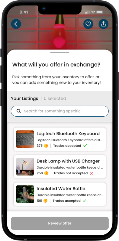
Listing creation
Easily post items or services for trade with detailed descriptions, images, and trade preferences.
Review-based merit system
Build trust by allowing users to rate and review past trade experiences.
Communication methods
Enable direct messaging and negotiation tools to facilitate smoother trade discussions.
Trader profiles
View verified user profiles with trade history, ratings, and past transactions for added transparency.
Trade proposals
Seamlessly propose and accept trade offers while reviewing item details and conditions.
I conducted an open card sorting exercise, allowing users to organize and prioritize elements based on their preferences, which helped shape an intuitive navigation structure.
Methodology
Findings
Opportunities
Sitemap
I created a sitemap based on results of the open card sort to establish the information architecture, ensuring a logical and intuitive structure for the platform that allows users to easily navigate and access key features.

User Flows
The user flows show how users move through the platform from the perspective of a someone who is listing a trade item as well as browsing for something new to acquire. This provides a well-rounded view of the platform’s functionality.


Brand Values
Trade Up is built on the principles of trust, sustainability, fairness, and community, ensuring a secure and engaging bartering experience.
The primary colors of navy blue and coral red establish a sense of reliability and urgency, while orange accents bring energy and excitement to the platform. A set of neutral grays ensures balance and readability.
Typography
Trade Up utilizes Poppins, a modern and approachable font that enhances readability and conveys a clean, professional, and friendly user experience.
Color Pallet


Brand Logo
After much iteration, I designed the Trade Up logo to symbolize growth and exchange, with an upward arrow representing progression through bartering. The bold, modern design reflects Trade Up’s mission to make trading smarter, more accessible, and community-driven.
Final design

Initial ideas
I created low-fidelity wireframes to outline the basic layout and structure, allowing me to quickly visualize and refine the overall design before moving into more detailed iterations.

Homepage

“You” Page

Storefront

Search Results

Listing Page
I conducted low-fidelity usability testing to evaluate the core functionality and user flow, allowing me to identify key pain points and make necessary refinements before progressing to high-fidelity iterations.
Tasks to be completed
Insights
Next steps
I developed high-fidelity wireframes to provide more detailed visual elements and interactions, ensuring the design was ready for prototyping and user testing.
Homepage

“You” page

Storefront

Search Results

Listing page
I conducted high-fidelity usability testing to assess the final design’s functionality, usability, and overall user experience, ensuring a polished and intuitive interface before implementation.
Tasks to be completed
Insights
Next steps
Priority Revisions
I iterated on the design based on feedback from usability testing, addressing issues like improving navigation, clarifying button labels, and enhancing the appointment management process for a smoother user experience.


After implementing priority revisions based on usability testing feedback, I finalized the design, ensuring a seamless user experience, improved functionality, and a visually cohesive interface.


